
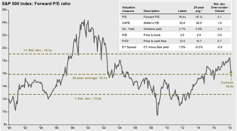
It’s hard to focus on your long-term investment goals when the equity market is so volatile. So far in 2018, daily moves in the S&P 500 are averaging 3 times larger than in 2017. Sometimes it helps to put things in perspective by looking at long-term valuations. Here are 5 charts to do that.
[listly id=”23RW” layout=”magazine” per_page=”25″ show_list_badges=”false” show_list_stats=”false” show_author=”false” show_list_tools=”false” show_item_tabs=”false” show_item_filter=”false” show_item_sort=”false” show_item_layout=”false” show_item_search=”false” show_item_timestamp=”false” show_item_voting=”false” show_item_relist=”false” show_item_comments=”false” show_sharing=”false”]